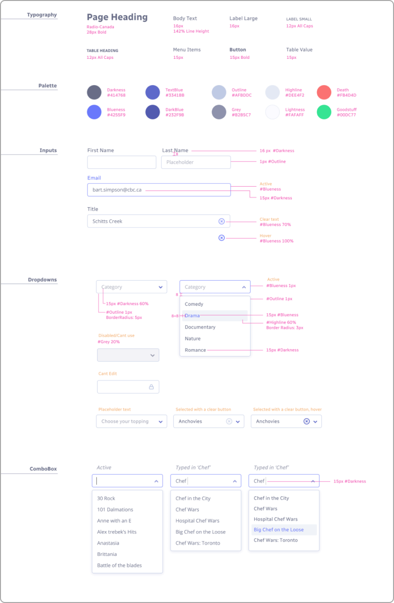
Component driven design
Deadlines were tight, as always, and we were under a lot of pressure to harmonize two totally different CMS’s that were the brains of two very different streaming platforms, fast.
After a couple weeks of research and interviewing the current cms editors on both systems, we were able to identify the pain points and requests for new features to help with their daily routines. Once we had this data, it was time to learn the actual pipeline for adding shows and movies to the streaming platform and seeing them online. That part took weeks, so we decided to start designing components that we know would be essential in this table and form heavy design system.
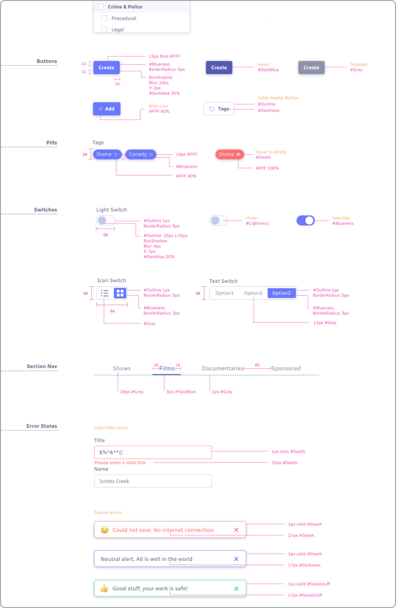
We started with very plain unstyled components, and later were able to revisit them to adapt branding and ease of use into them. Not the ideal way to go about a design system, but this let the developers get going while we were still gathering our design marbles.
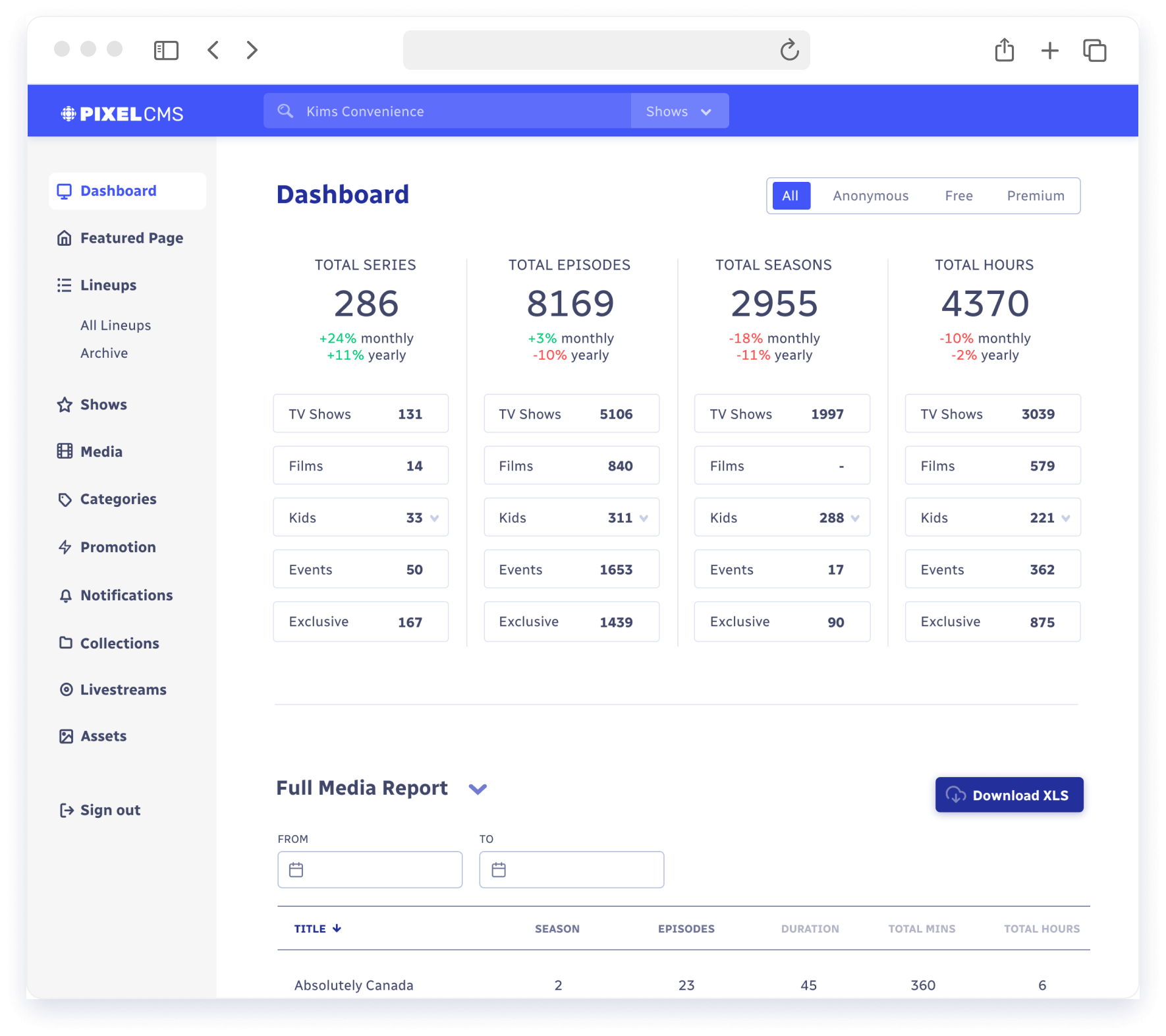
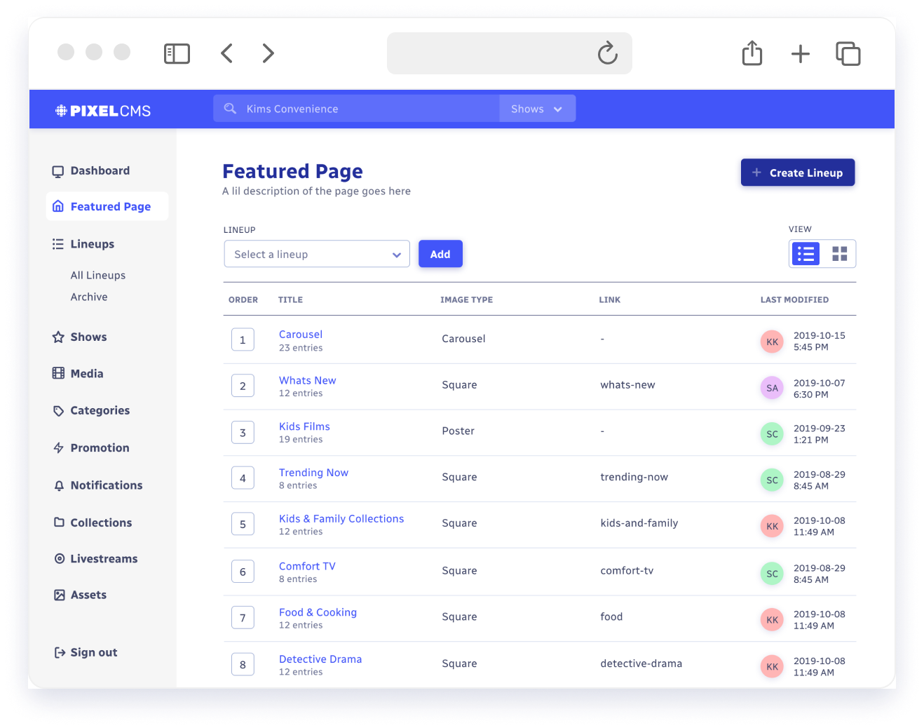
Daily analytics
Daily and monthly reports on system inventory was major pain for current users, and we were shocked ot find out they were just adding up items in spreadsheets.
We added a full dashboard to give a quick overview of the current media library, and how it compared month over month, and eventually year over year (once we had that historical data).
Stats were able to be filtered by membership tier, and then broken down by the main categories of tv shows, films etc.
In addition to the dashboard, users were still able to choose from a list of common reports they would have to produce regularly, preview in a nice table, and then download to excel format. We could even filter those reports to only show a certain date range.
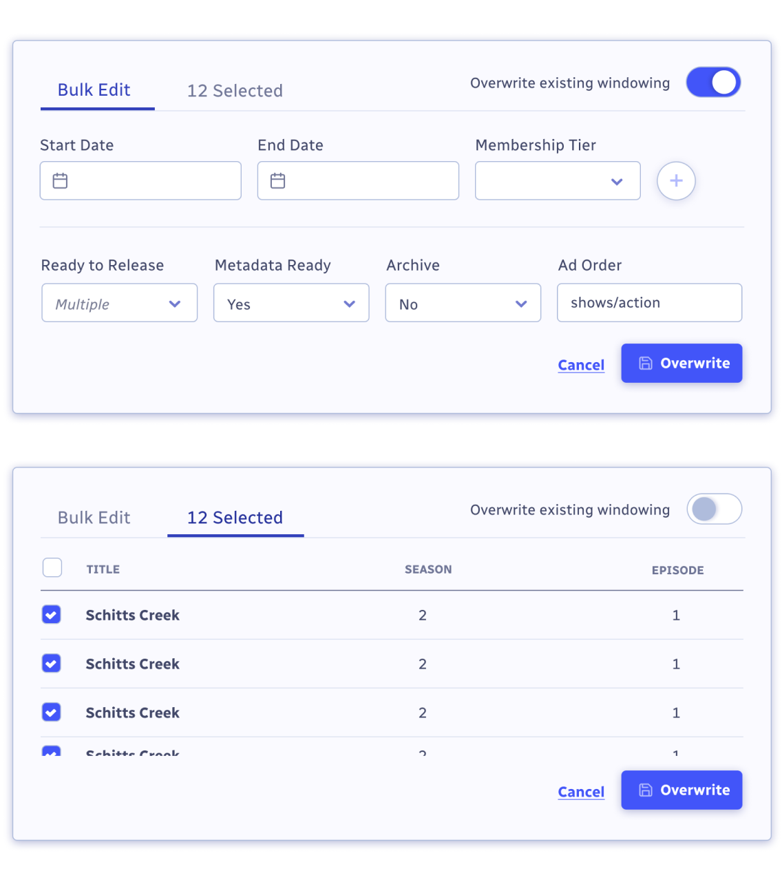
Editing in bulk
There was lots of focus on repetitive tasks from our user interviews. Many times we found that a change needed to be made to a whole season of a show, and that had to be done to each episode individually.
We created a bulk edit modal that would apply changes to whatever items are selected in a media table. The controls and features were a bit too robust to have in the header of a table, so we created a modal to make these bulk changes. Users can apply multiple date windows across multiple titles at once, as well as add yes/no options to each title.
We decided on having an extra tab that would serve as a visual reminder of the titles that would be affected by the bulk edit. Quick user testing with a prototype showed this was more effective than just relying on a confirmation window.
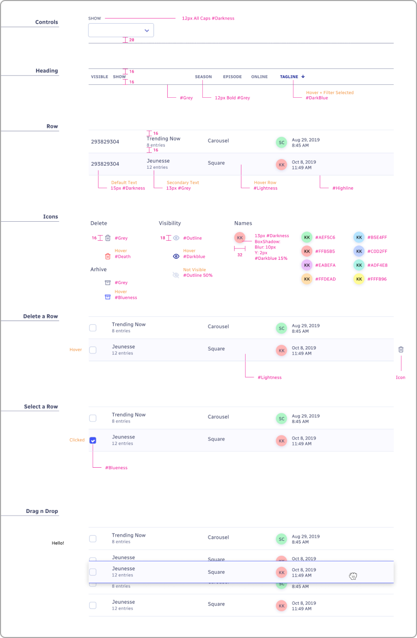
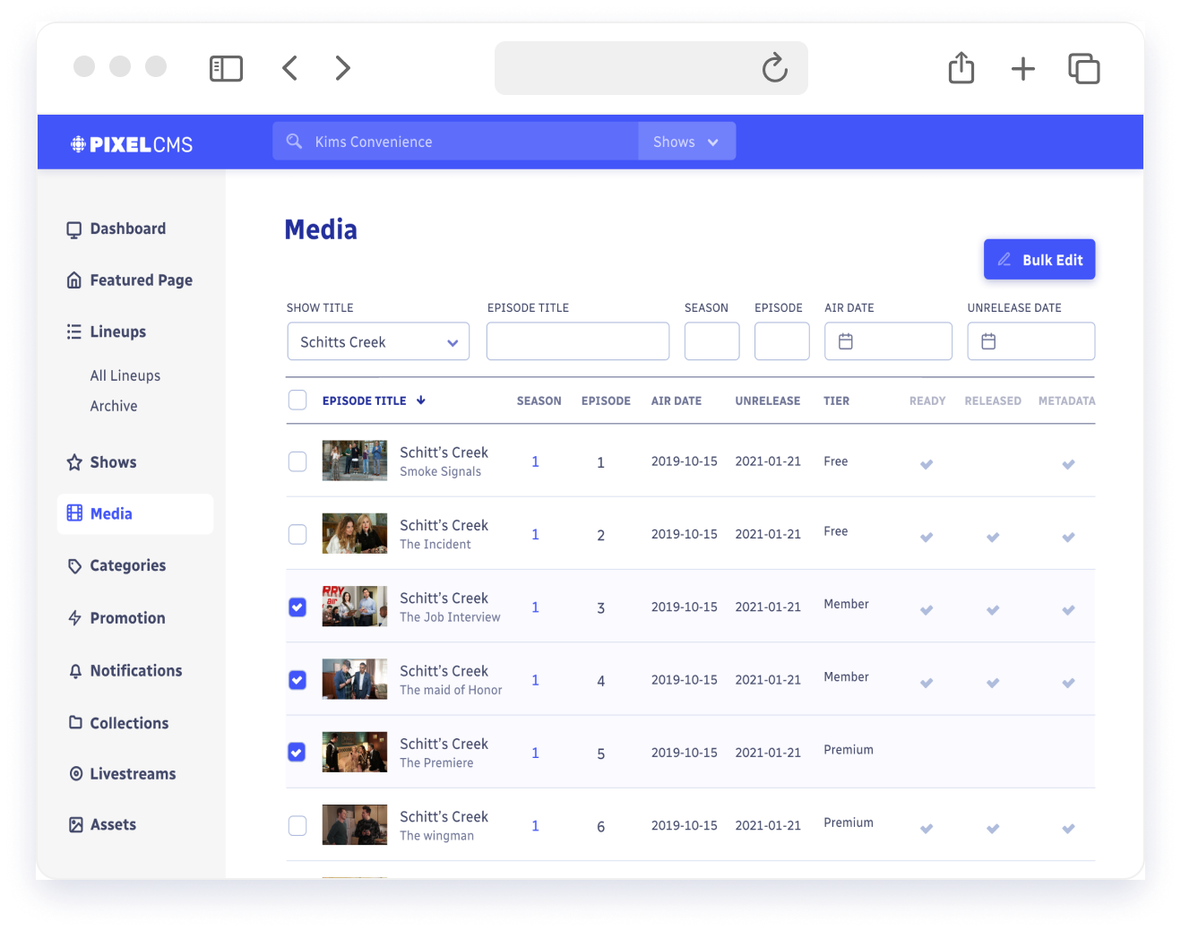
Tables and forms
We quickly found out that most of the CMS will be tables and form fields. There was just so much data and media being handled that a table was always the best way to show it all.
Supercharging these tables was paramount, and adding powerful but easy to use controls atop each one was top priority. We took a lot of notes from other sites handling large data in simple ways like Google Fonts and Notion.
The users of the CMS would all be concidered power users, so having sortable tables by columns and search fields was a common ask. Giving users the power to display their selection of data in precise ways all while keeping it simple was always at the forefront of our design language.
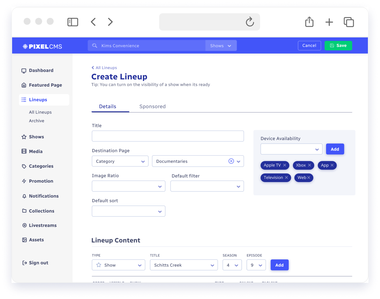
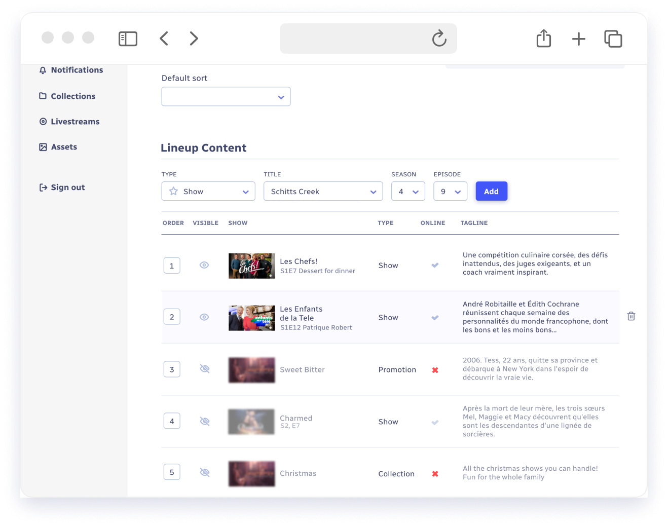
Creating Lineups
Creating lineups served as an abstract way of grouping content into a folder. Once a lineup was created, the user could then use that grouping in a swimlane on the homepage, as the content of a carousel, as the source for a collection etc.
It’s one of the more powerful flows in the CMS, and we wanted to simplify it without losing any capabilities. Main details for the lineup appeard up top, while the content appeared in a table below.
Visual thumbnails were inserted into each row to remind the user exactly what piece of content they were inserting, along with other power features like toggling visibility and checking it’s online status in the catalogue.
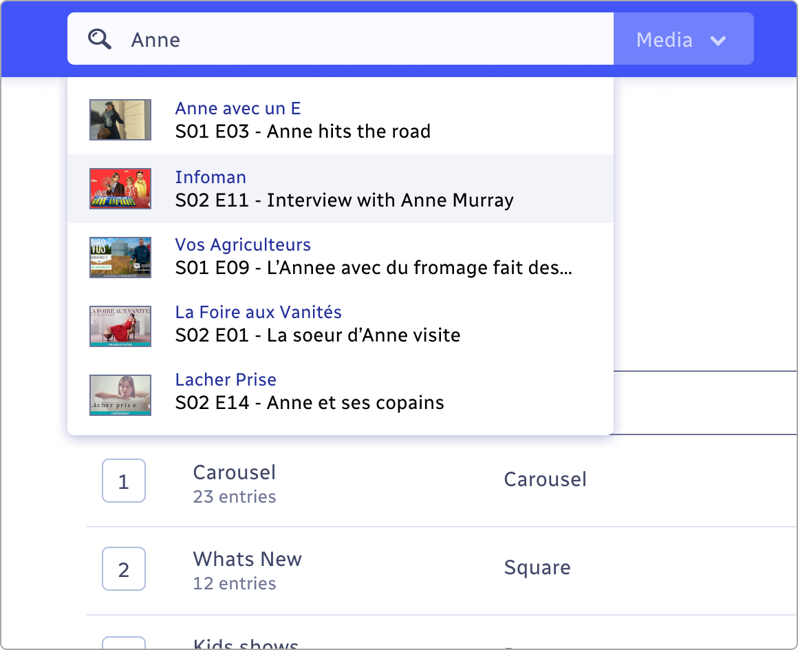
Global Search
One of the key user needs we took away from interviews was the ability to quickly get to a show or episode in the CMS.
Users all had different tricks and paths to get to those desired pages, but all were workarounds. We decided having a global search would be a useful enough function to always be persistent in the main header. We wanted them to get to their desired page as quickly as possible, so no messing around with search results pages, all results would show right there in an autocomplete dropdown box. Result information was concise showing 2 lines and an image for each result. One line was the actual media title and the other line was secondary information like show or type of media.
Keyboard navigation was later added for both accessibility requirements but also just to speed up getting to where you wanted to go.
Early stages
The hardest part early on was just figuring out how the two seperate CMS’s worked, and getting a handle on the actual everyday userflows. The systems were overly complex, and in CBC’s case, they used software created by IBM that clearly over delivered and left many new users to the team frustrated.
We completed dozens of interviews on both sides and started piecing together how we thought a typical userflow would act, and then we would go back to the users with our rough wireframes to make sure everything made sense.
Once all of those were approved we could start designing the actual UI components and functionality that made a complex system look a lot more friendly.