Stories for Canada
The longform stories project was designed to showcase the best of CBC’s journalists and tell stories from all around the nation.
These stories were meant to be rich in content and span longer periods of research and writing. They should be able to stand on their own, and break out of the monotony of the usual news stories that filled CBC.ca everyday.
Templates had to be designed to suit the needs of any story, no matter the content or intened audience. This means fully complying with wcag accessibility standards so that all Canadians can enjoy this premium story telling.
Simplified design system
The longform project needed a design system that worked with any type of story, whether it had a serious or humourous tone.
Writers would be coming into the CMS to cobble together their longform stories on their own, so simplicity was super important and we didnt want to overwhelm them with tons of customization. This had been a deterant in the past that required writers to seek out developers to get their stories told properly online.
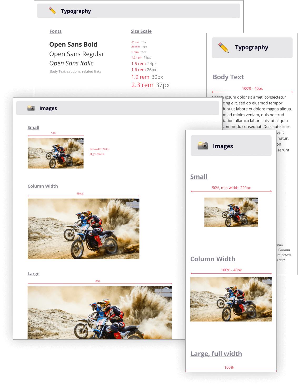
Things like image sizes, typography, image grids, were all scaled down to offer a few options, in easy to digest language. We used t-shirt sizing for most image sizes, and the same went with the typography. We had more explicit sizing and instructions for the developers, and then simpler language to be used in the actual interface.
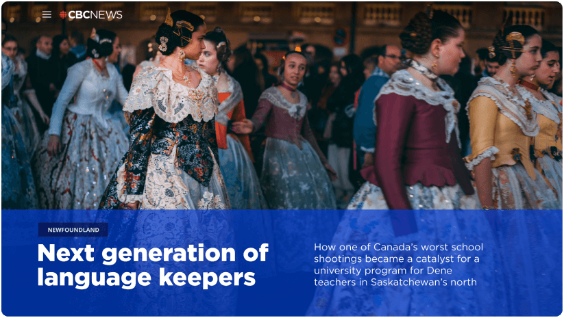
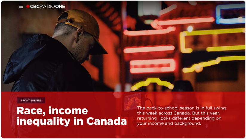
Colours were something you could choose at the beginning of setting up your article, and even that was simplified. One colour choice was all they got, making sure we covered a lot of the hues associated with the common verticals that would be writing these pieces. That accent colour would update across all the components used in the story, giving each piece its own personality from the next longform.
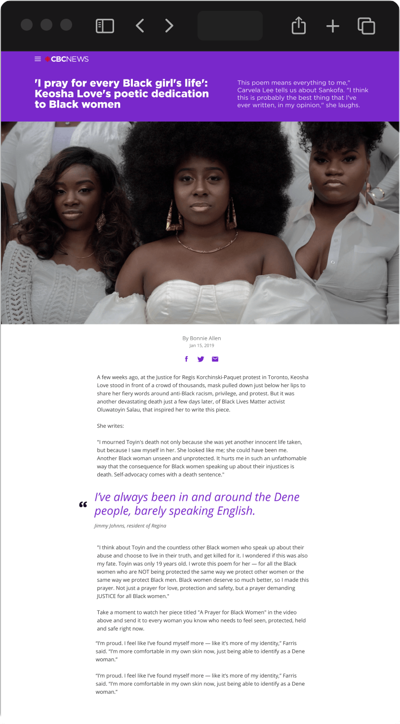
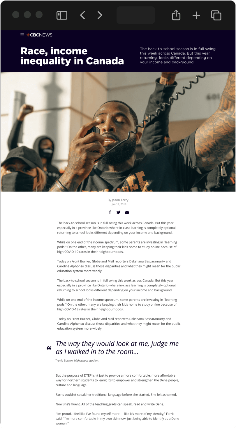
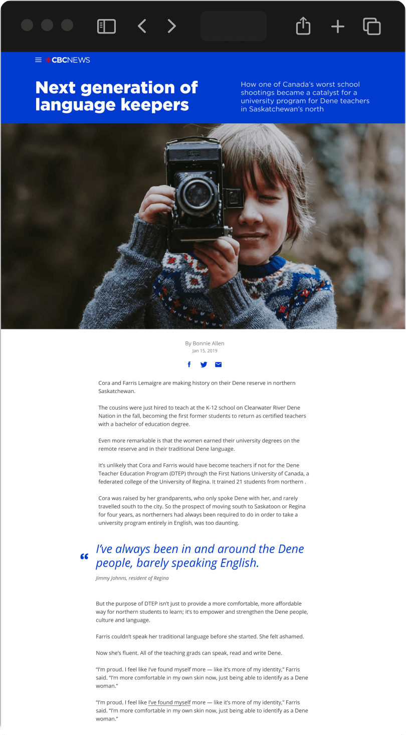
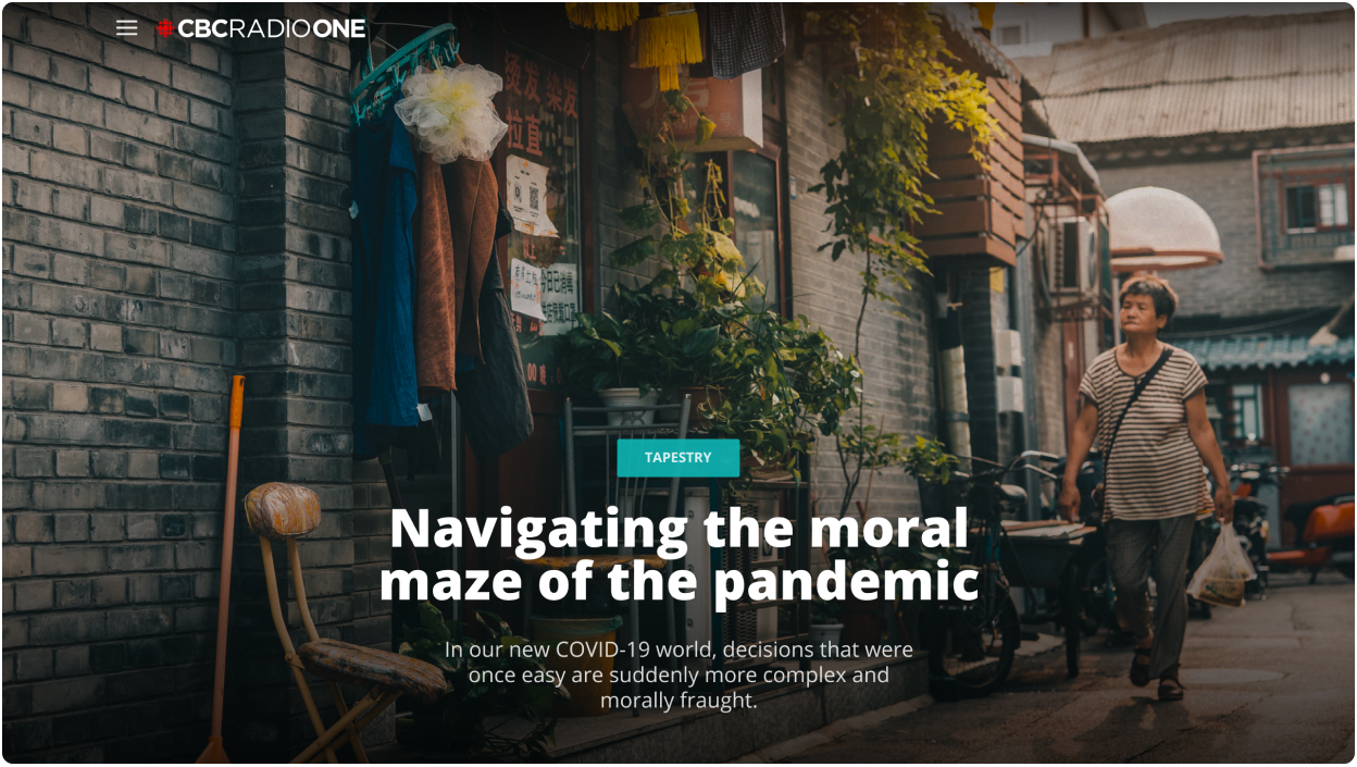
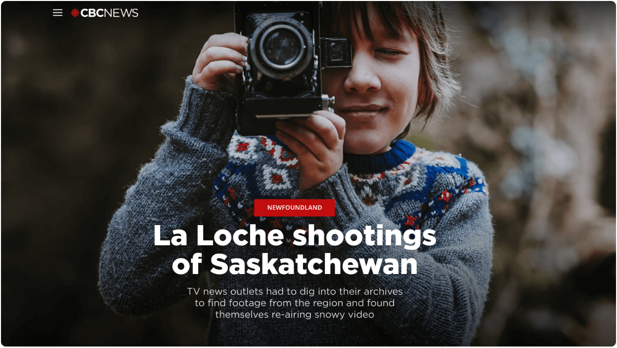
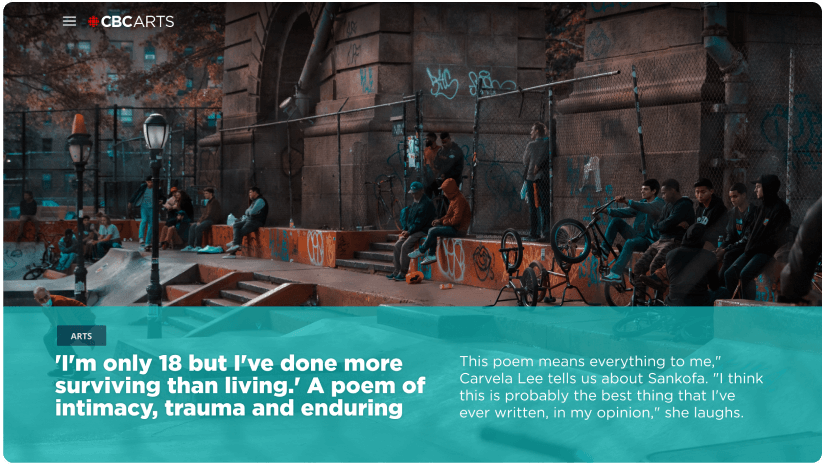
Heros in different flavours
The templates had to work with different stories, which could vary from inspirational to thoughtful to provocative. We needed to have an offering of different layouts for the hero treatment to set the tone for the long story thats about to unfold.
Writers could choose from a trio of templates for the hero treatment, as well as highlight colours to accompany the story. These highlights would appear in the hero, but also throughout the rest of the story, accenting the different components.
Dynamic typography
Because writers would just be inputting titles and bylines into the cms, we had to make sure the designs worked properly for all sizes of titles.
We experimented with a few dynamic type solutions, playing with how to render the font size in the titles, and how it could affect the byline as well. Many units we tried to use, like viewport width, came with accessibility concerns, and wouldnt scale up properly with a screen magnifyer.
In the end the developers worked their magic, and the titles had their own set space that would shrink the font size to fill up the container.
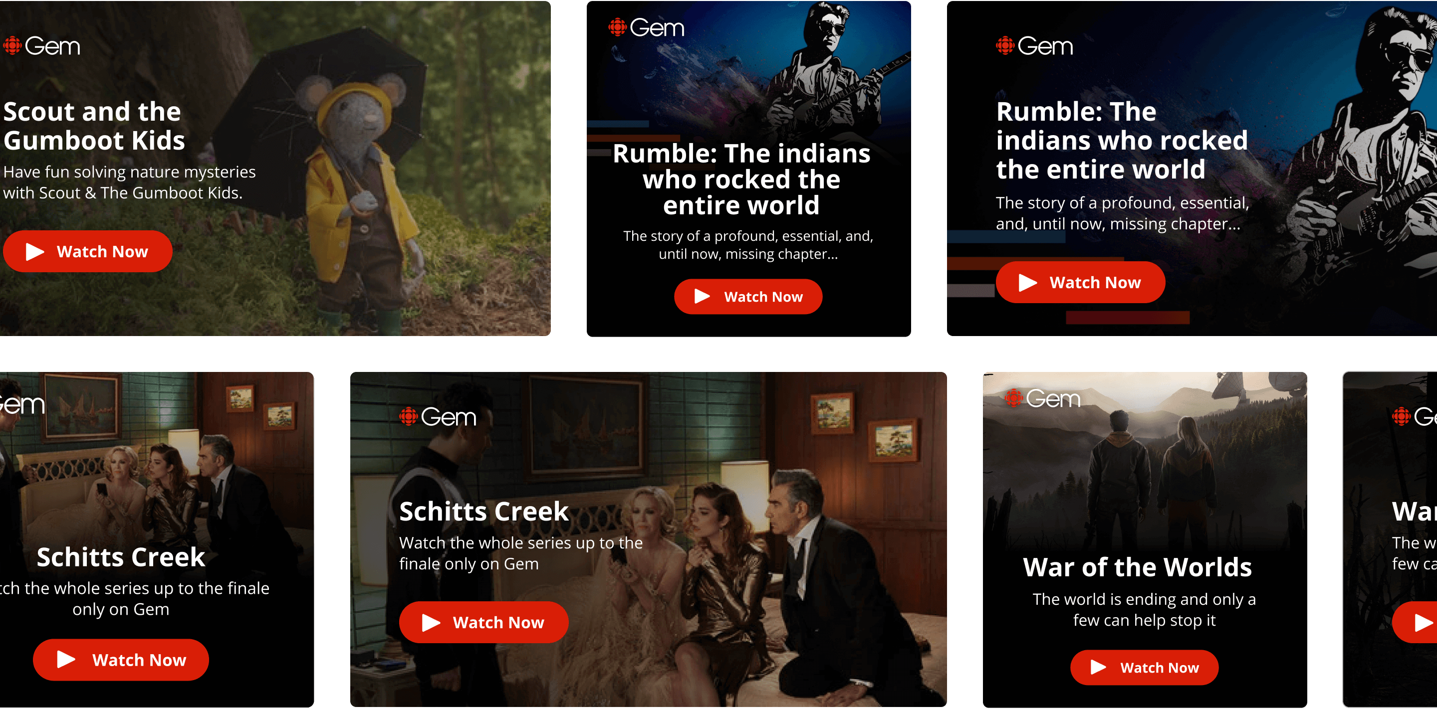
Cross platform promotion
Making use of CBC’s extensive reach across its other marquee sites was important and was addressed through a series of cards that could be generated from a dropdown in the cms.
For tie-ins to streaming media on Gem, cards were embedded into stories with adaptable layouts to work on mobile and desktop, all using the same key art asset. Those assets were already available and were directly linked to the longform cms.
Designs were meant to not take away from the main story, but also give the user a chance to break out to relevant content across CBC’s extensive network. CTAs were present in all cards to quickly distinguish whether they would be going to an article, video, podcast, etc.
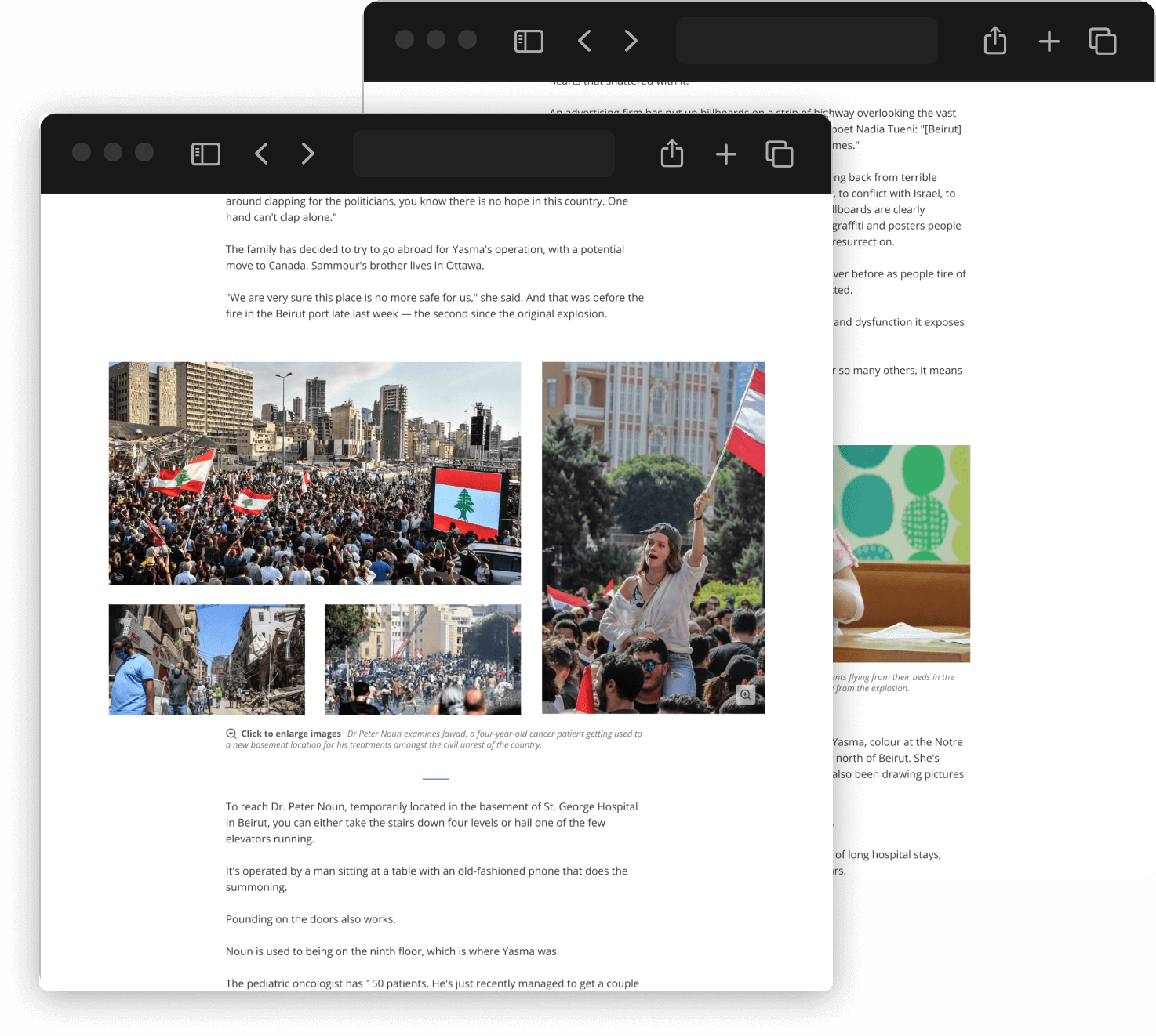
Photography components
Photos are fairly important to each story, so we had to cover a lot of bases based on a lot of requests.
Options for 1-up and 2-up photo lockups were designed, as well photo collages that gave more of a gallery feel to the article, without hiding a bunch of the photos. Collages had a few different variations designed based on the amount of landscape and portrait photos added in the CMS.
Collages had interactive components that allowed users to zoom in on one and start a more full screen viewing experience. Keyboard navigation was added to make sure the gallery experience was still accessible by all.