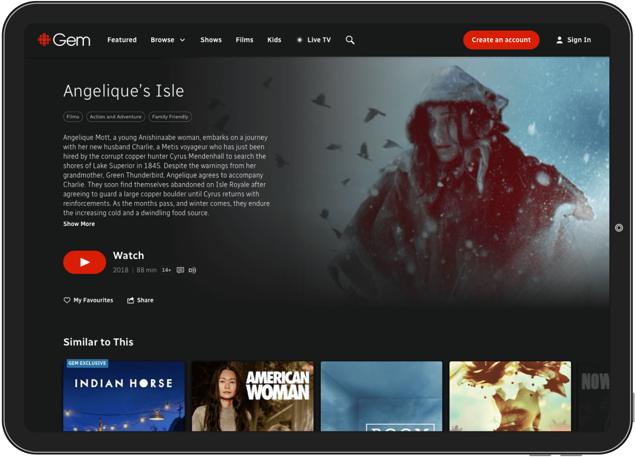
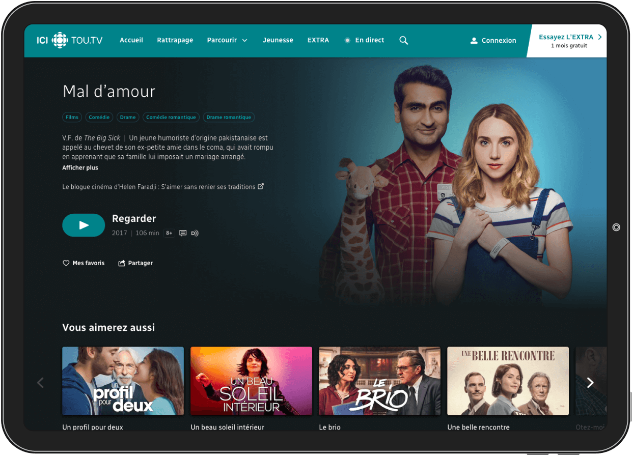
Two languages,two audiences
The project’s driving responsibility was to harmonize the current streaming platforms that existed in French Canada and English Canada. They both had different names, different audience reach, different libraries, but ultimately shared the same goal - deliver first class Canadian films and documentaries to the entire country.
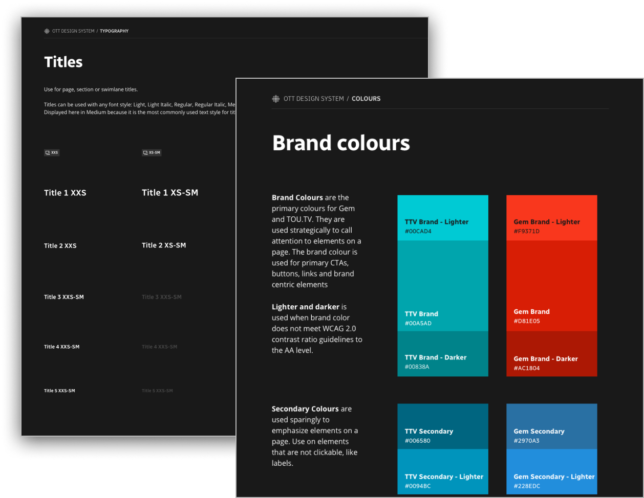
Creating ONE design system that could be used between both products would not only strengthen the visual identities of CBC and their french counterparts, but also development of components would happen once. Create a component for one side, and the other side automatically gets it for free.
The idea was born to create a design system of identical UX, and apply seperate themes to the french and english products. We would try to keep everything identical, but still allow each product’s own flavour to come through in colours, language and branding.
Navigation in TV land
Although research showed us plenty of our users were cable cutters, there were still plenty using multiple devices to stream Gem to their televisions and enjoy the content on their big screen.
Mockups were created for TvOS and AndroidTV, our 2 main TV streaming devices. With these TV solutions came the ability to navigate through remote controls, D-pads and even swipe gestures.
Both platforms came with very different native components for text input, so the design system had to have a lot of flexibility here to not force the user into using a pattern that was off from the rest of their TV apps.
Screen real estate is paramount, and we did not want the user to ever be far away from accessing the navigation, or jumping back to a swimlane they were on.
Wireframes set the ground rules
One of the things we were extra sticky about was the source of truth that the wireframes would provide for developers and analysts. We made sure that naming conventions in our wireframes were carried over to the developers side, to ensure we were all talking about the same ‘things’ at every step.
Wireframes were stored in Abstract and fully inspectable by developers. Although most elements were inspectable, we did mark up spacing blocks visually. Spacing and margins were grouped together with their respective components to show what disappears when a part of the wireframe isnt used.
Supporting allll the devices
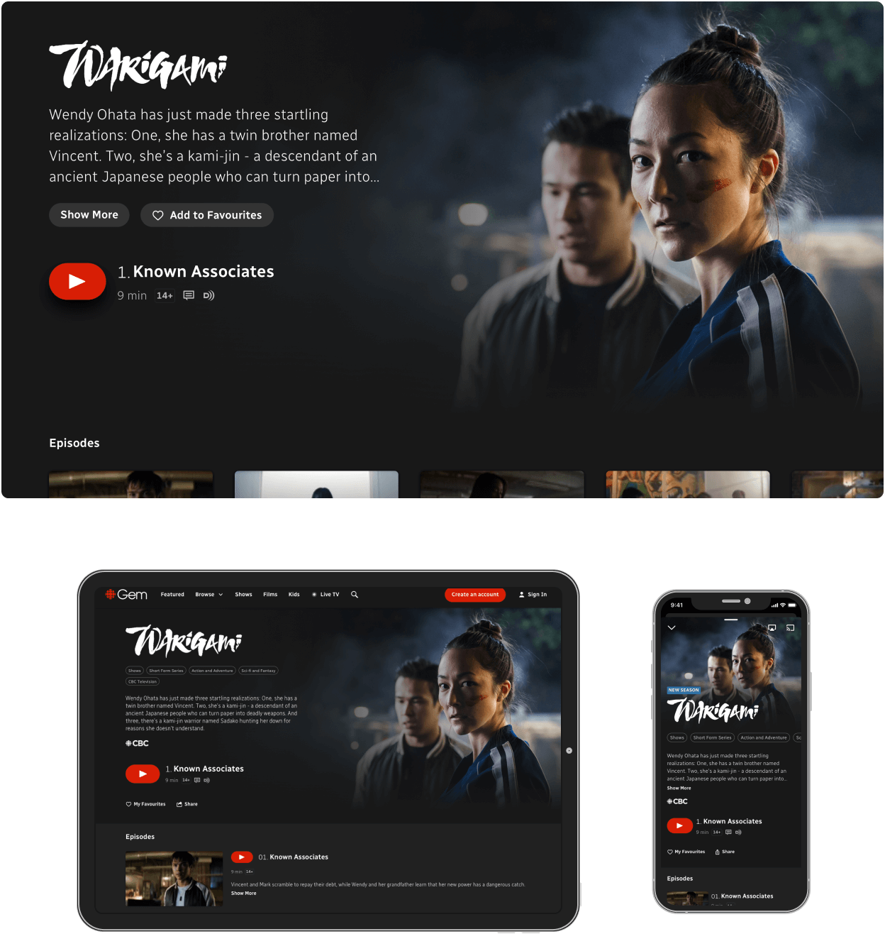
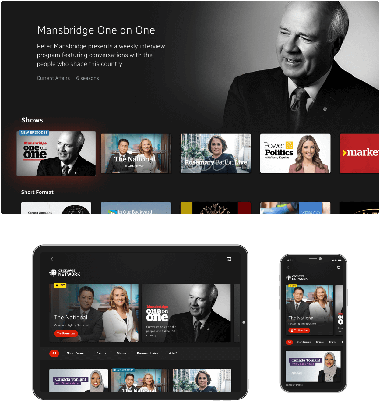
Streaming platforms are expected to run on just about anything, and users definitely expect to pick up where they left off, whether it be on the train or in the living room.
We used a ‘Large’ desktop breakpoint as the starting point for most new designs, and worked our way down to 5 breakpoints that covered web use on a mobile phone up to a desktop. From there we could reuse some designs for iOS and Android mobile and tablet devices. Portrait and landscape mocks had to be factored in later to accomodate newer WCAG accessibility needs.
TV was designed at 1920x1080, but we also future proofed a lot of the assets at 4K resolution. Not overwhelming the user with huge payloads on TV was a big issue that we tried to solve with smarter preloading.